
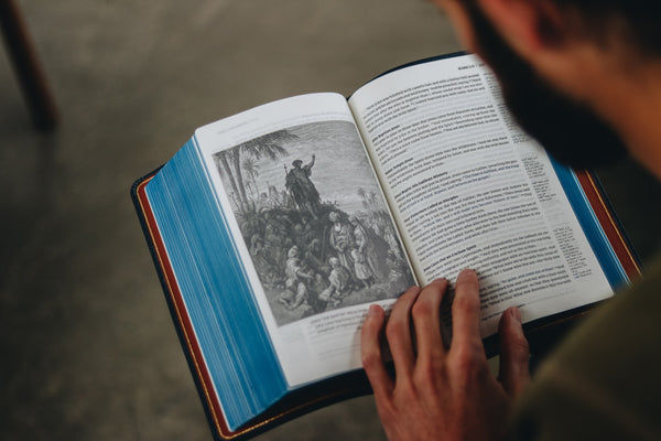
The Word of God Reimagined
Rediscover the Bible with Humble Lamb. Our modern take on classic designs offers a fresh experience - as if you're reading the Word of God for the first time.
The Humble Lamb Bible Collection




The Lamb's Journal: A legacy of Pages
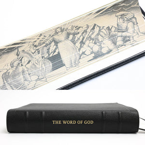
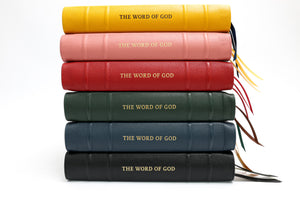
Your life’s journey in one place. With an unprecedented 1,408 pages, the Lamb’s Journal provides endless space for your prayers, sermon notes, and creative reflections. Handcrafted with premium leather and featuring a stunning fore-edge gilt of Christ, it is the definitive companion to your Humble Lamb Bible.
Masterfully Handcrafted
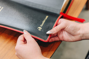
Our Bibles are crafted with quality materials and binding techniques to not only feel amazing but also stand the test of time. This makes it a perfect heirloom to be passed down for generations.
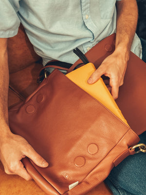
Simplified travel with Humble Shield
Grab and go with ease! Our Humble Shield messenger bag is perfect for church and beyond. It not only keeps your Bible safe and pristine but also offers space for an iPad or notebook, phone, pens, and more—all your essentials in one place.
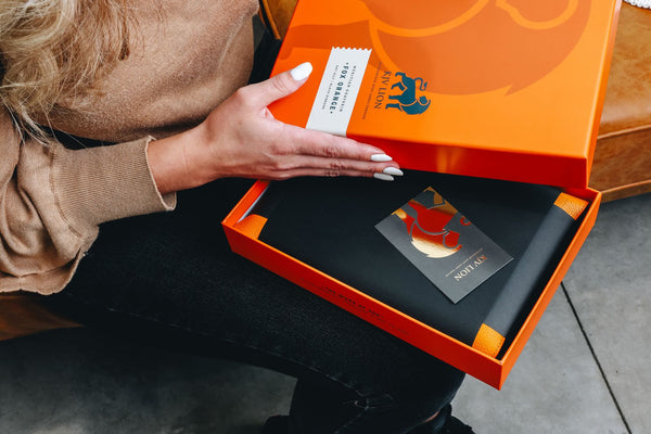
Your Forever Bible
From the packaging to the layout, Humble Lamb Bibles are designed to attract you to the Word of God, making it that much easier to get into the Word.

Words of Christ in Blue
Humble Lamb Bibles highlight the words of Christ in a refreshing Blue while also being color-blind friendly.
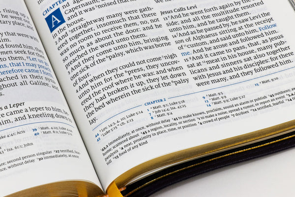
Stunning layouts
Our range of Bibles are designed with readability in mind. We've been meticulous in font choice, letter spacing, layout and more to make each page a delight to absorb.
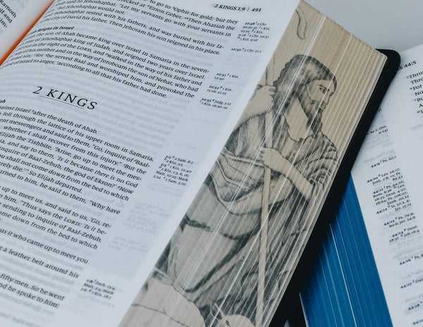
Hidden Art
Our thoughtfully curated fore-edge detailing allows you to choose from a range of colours, or Pointillism art, that reveals itself from the gold edge as you open your Bible.
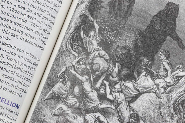
Historical Illustrations
Humble Lamb Bibles feature Illustrations from the prolific French printmaker Gustave Doré depicting rich scenes from your favourite stories.
Let customers speak for us
🔥🙏😇

love it!! 🔥🙏😇
Best Bible on the market today, love everything about it. The pages pop out at you
I really like the design of the NKJV Bible by Humble Lamb. They really put a lot of emphasis into making quality Bibles. Worth the buy if you are looking for a good Bible
It's a great Bible and I am very pleased with the purchase. I would recommend it to anyone that wants a premium Bible.
Don't forget to read it and study it daily. Thank You Humble Lamb.

I love this Bible! Beautiful craftsmanship.
This is a fantastic Bible. It is top quality all around and beautiful. Humble Lamb does such a great job on their Bibles. I had never used the BSB translation before and I am enjoying that as well.
Since it is a first edition there are a few kinks that will probably be worked out in future printings. I don't mind too much, and they were up front about the Ruth summary page. But know that there is a typo in the text of Exodus 16:23, it reads LOTRD instead of LORD. And some minor formatting issue in introduction to Daniel. It is all pretty minor issues so I still give it 5 stars.
I am loving my new Humble Bible! The BSB version is easy to read and understand and I am thoroughly enjoying it! The pages of the Bible are so soft as well as the cover. I also really like the softness of the blue letters for Jesus’ words. It is subtle but gives a good dimension for His words to stand out. This is a Bible I tend to cherish and hopefully pass down to my kids and grandkids some day!
This is such a beautiful bible. I love it!

I love my Humble Lamb Bible. It’s really drawn me in to keep reading rather than setting it down. I find myself in the Word more than ever before.

Love it!!
Please note:
the colors are not matching the site photos, the real colors are darker than advertised.
I truly loved this Bible. I have been a follower of Jesus for over 50 years and have many Bible’s. This is my first genuine leather Bible.
I also appreciate the single column Bible and the introductions are very simple and true. I read this Bible almost daily and enjoy the tiny footnotes and clarity of different meanings of words. Thank you for making it available your Brother In Christ Phil.
After having other translations in the black and wool combo, I bought the NLT SonRise. Beautiful Bible! I love the single column text and the drop caps.
This is an excellent Bible well presented well laid out, print quality is excellent and the pictures are lovely too. Would highly recommend this Bible to anyone. It is a credit to humble lamb. Thank you Jesus.
The illustrations are beautiful. The goatskin feels great. I would recommend this to anyone who loves reading the Bible. Though the misprint in Ruth is a letdown.

